
For years, Google ranked websites mainly by their desktop version. Today, that has completely changed. With mobile-first indexing, Google now looks at the mobile version of your site first — and uses it to decide where you rank.
So if your mobile experience is slow, broken, or missing content, your SEO suffers everywhere. Even desktop rankings depend on how well your site performs on phones in 2026.
This guide explains what mobile-first indexing means, how it works, and exactly how to make your site mobile-ready — without confusing jargon.
What Is Mobile-First Indexing?
Mobile-first indexing means Google uses your website’s mobile version as the main source for indexing and ranking. Even on desktop searches, Google checks the mobile version first.
Google made this shift because over 60% of searches now happen on phones. So mobile experience now decides almost everything about your visibility.
Why Mobile-First Indexing Matters in 2026
Mobile-first indexing impacts every site, big or small. Here is why it matters today:
- Mobile content drives your overall rankings
- Mobile speed shapes Core Web Vitals scores
- Mobile UX affects bounce rate and dwell time
- Mobile usability errors reduce ad performance
- Mobile-friendly sites earn more featured snippets
Therefore, even a small mobile fix can lift your SEO across the board.
How Mobile-First Indexing Actually Works
Googlebot now crawls your site using its smartphone user agent. It looks at:
- The mobile HTML and content
- Structured data (schema markup)
- Images, videos, and alt text
- Internal links and navigation
- Page speed and Core Web Vitals
So if any of these are hidden, missing, or broken on mobile, Google does not see them — and your rankings can drop.
Signs Your Site Is Failing Mobile-First Indexing
- Tiny text or buttons hard to tap
- Content hidden behind tabs not crawled by Google
- Pop-ups blocking key content on mobile
- Mobile pages slower than 3 seconds
- Different content between desktop and mobile
Watch for these red flags inside Search Console’s Mobile Usability report.
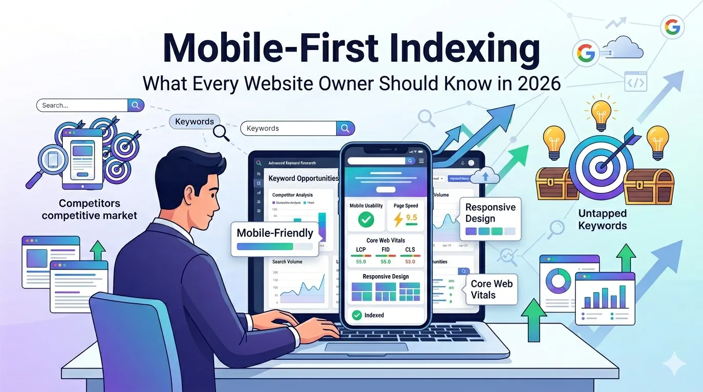
How to Test Mobile-First Readiness
Testing takes just a couple of minutes. Use these free tools side by side.
Step 1 — Run a Mobile-Friendly Test
Try our free Mobile Friendly Test. It checks if your page passes Google’s mobile usability rules.
Step 2 — Check Mobile Page Speed
Use our Page Speed Test to view LCP, INP, and CLS on mobile devices.
Step 3 — Audit Mobile Content
Open your site on a real phone. Compare content with the desktop version. Anything missing on mobile may not be indexed by Google.
Mobile-First Indexing Best Practices
Follow these proven steps to win at mobile-first indexing:
1. Use Responsive Design
Responsive layouts work on every screen size. So a single URL serves both desktop and mobile users — exactly what Google prefers.
2. Keep Mobile Content Equal to Desktop
Never hide content on mobile to “clean up” the UI. Always show the same text, images, and headings on both versions.
3. Optimize Mobile Page Speed
Compress images, minify CSS/JS, and use lazy loading. Then test again with our Page Speed Test.
4. Use Readable Fonts and Tap-Friendly Buttons
Use at least 16px font size and 48px tap targets. Mobile UX directly affects rankings under mobile-first indexing.
5. Avoid Intrusive Pop-Ups
Google penalizes mobile pop-ups that block content. Use slide-ins or banners instead.
6. Add Structured Data Everywhere
Schema helps Google understand mobile content. Use our Schema Generator for quick markup.
Responsive vs Adaptive vs Separate Mobile Sites
| Setup | Best For | SEO Impact |
|---|---|---|
| Responsive Design | Most websites | Best |
| Adaptive Design | Heavy device-specific UX | Decent |
| Separate m.subdomain | Legacy systems | Hardest to maintain |
So if you are starting fresh, choose responsive design every time.
Common Mistakes Site Owners Still Make
- Showing fewer products on mobile
- Using “display: none” to hide important text
- Forgetting alt text on mobile images
- Using interstitial ads that block content
- Skipping mobile structured data testing
Fixing these small issues unlocks faster wins than expected.
Quick Mobile-First Checklist
- Test with our Mobile Friendly Test
- Make content identical on desktop and mobile
- Use responsive design where possible
- Improve LCP, INP, and CLS metrics
- Use big tap targets and readable fonts
- Remove intrusive mobile pop-ups
- Validate structured data across templates
Follow this list once a quarter to stay ahead of every algorithm update.
Tools That Help You Win Mobile-First Indexing
- Mobile Friendly Test — confirm mobile usability
- Page Speed Test — measure mobile CWV
- Website SEO Score Checker — overall mobile health
- Schema Generator — add fresh structured data
Combine these tools monthly for a 360° mobile-first audit.
Final Thoughts
Mobile-first indexing is no longer “the future” — it is the present. Your mobile experience now decides your SEO destiny.
So, take five minutes today. Run our free Mobile Friendly Test, fix what is broken, and watch your rankings, traffic, and conversions improve in 2026.
FAQs
Google uses your mobile site version as the main source to crawl, index, and rank your pages.
Yes. Even desktop search results use the mobile version of your site as the main signal.
Yes. Responsive design is Google’s recommended setup since it serves the same HTML to all devices.
Google will only see the mobile content. So missing mobile content can hurt your rankings significantly.
Open Google Search Console. Under Settings, check the crawler type. It should say Googlebot Smartphone.
Yes. Intrusive pop-ups that block content can cause ranking drops, especially on mobile devices.
Run a mobile audit every 1–3 months and after every major site update.