
Great websites do not just look good — they convert. And one of the simplest design choices that powers conversion is typography. So choosing the best Google font pairings is no longer just an aesthetic move. It is a smart 2026 strategy.
Fonts shape trust, readability, brand feel, and even speed. A clean pairing can lift CTR, dwell time, and sales. A messy one can ruin everything.
This guide reveals the best Google font pairings, why they work, and how to test combos with a free tool to build a high-converting site fast.
Why Font Pairings Matter for Conversions
- Improve readability and dwell time
- Build immediate brand identity
- Boost mobile and desktop accessibility
- Strengthen visual hierarchy
- Boost trust and conversions across pages
So the right combo turns words into results.
What Makes a Great Font Pair?
- Clear contrast between heading and body fonts
- One serif + one sans-serif works most often
- Both fonts have multiple weights
- Both load fast and work on mobile
- The personality matches your brand voice
Good pairs feel intentional, balanced, and easy to scan.
10 Best Google Font Pairings for 2026
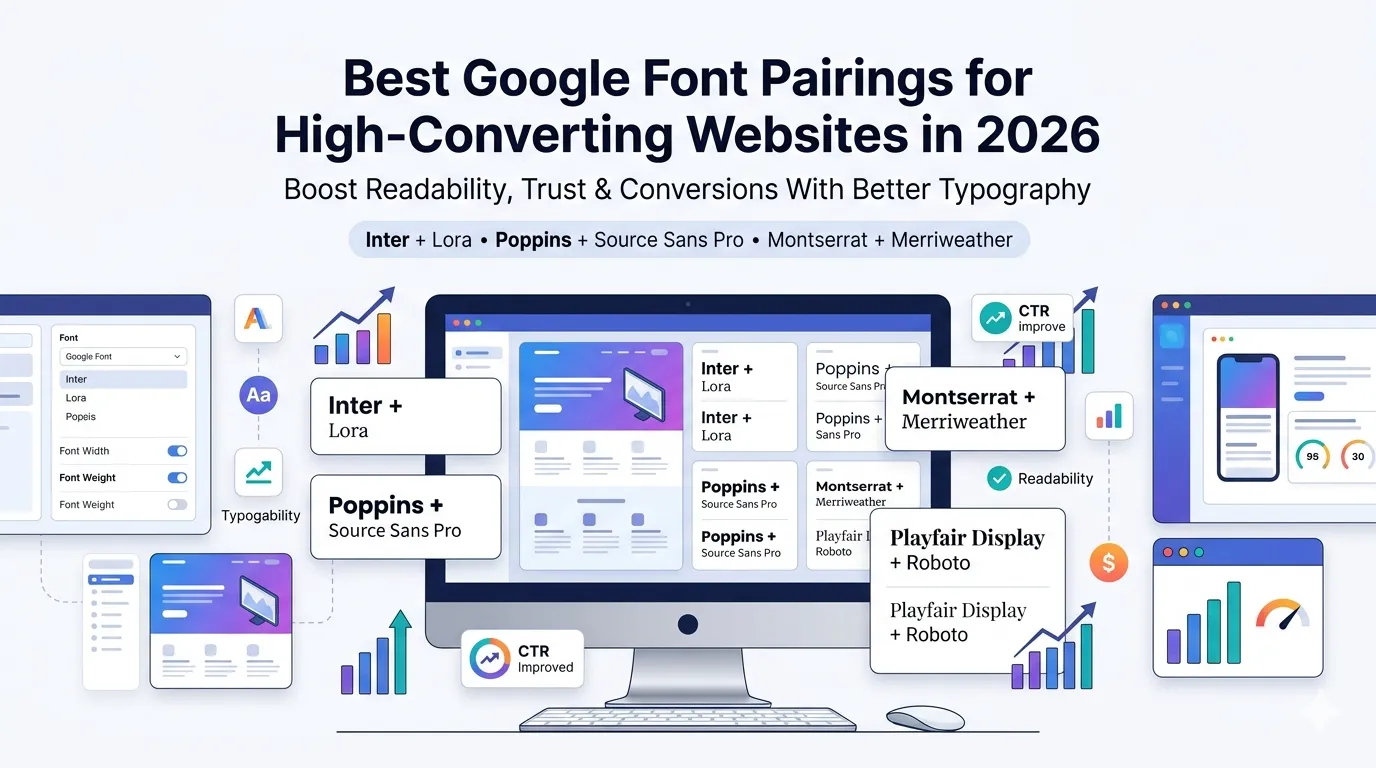
1. Inter + Lora
Inter for headings, Lora for body. Modern, professional, perfect for SaaS and tech blogs.
2. Poppins + Source Sans Pro
Friendly headlines with ultra-clean body text. Great for startups and marketing sites.
3. Montserrat + Merriweather
Bold modern headlines pair beautifully with serious editorial body. Loved by publishers and news sites.
4. Playfair Display + Roboto
Elegant serif headings combined with crisp body text. Premium feel — ideal for fashion and luxury brands.
5. Raleway + Open Sans
Stylish and balanced. Perfect for creative agencies and portfolios.
6. Manrope + Inter
Both modern, both clean. Best for AI tools, SaaS, and minimal portfolios.
7. Work Sans + PT Serif
Confident headlines with calm body text. Loved by SaaS, finance, and B2B brands.
8. Nunito + Lora
Soft, rounded headings with classic body. Great for e-learning and family-friendly brands.
9. DM Sans + Karla
Modern, slightly playful, but still professional. Perfect for creators and online courses.
10. Bebas Neue + Open Sans
Strong condensed headings with neutral body. Ideal for sports, gyms, or bold landing pages.
Best Font Pairings by Industry
| Industry | Top Pairing |
|---|---|
| SaaS / Tech | Inter + Lora |
| Fashion / Luxury | Playfair Display + Roboto |
| News / Editorial | Montserrat + Merriweather |
| Creators / Courses | DM Sans + Karla |
| Local Services | Poppins + Source Sans Pro |
| Fitness / Sports | Bebas Neue + Open Sans |
So pick the pairing that matches your audience’s emotion.
How to Test Google Font Pairings Live
Step 1 — Use the Google Fonts Pair Finder
Visit our free Google Fonts Pair Finder. Try combos instantly with custom text and styles.
Step 2 — Test on Mobile
Always preview pairs on small screens too. Mobile readability decides 60% of your SEO.
Step 3 — Audit Site Speed Impact
Check that your fonts do not slow your site. Use our Page Speed Test after embedding.
Font Tips That Boost Conversions
- Use only 2 fonts per page
- Keep body text 16–18px on mobile
- Maintain 1.5x line height for readability
- Pair light + bold weights for contrast
- Avoid trendy fonts that age fast
Small tweaks like these can lift conversion rates significantly.
Common Font Pairing Mistakes
- Using two similar fonts (no contrast)
- Combining too many decorative fonts
- Loading 8+ font weights on one page
- Ignoring mobile readability
- Forgetting brand voice when choosing
So always preview and audit before launching.
How Font Choice Affects SEO
- Clean fonts boost dwell time
- Faster loading improves Core Web Vitals
- Better readability lifts CTR and conversions
- Strong typography increases trust signals
- AI search favors clearly structured content
Pair your font tests with our Page Speed Test and Readability Score Checker for a complete UX audit.
Bonus: Best Fonts for Buttons and CTAs
- Inter Bold
- Poppins SemiBold
- Manrope Bold
- Work Sans SemiBold
- DM Sans Bold
Strong buttons feel clear and clickable — and that boosts conversions instantly.
Final Thoughts
Choosing the best Google font pairings is one of the easiest yet most overlooked ways to boost engagement and conversions. With the right combo, your site becomes faster, friendlier, and more memorable.
Start now with our free Google Fonts Pair Finder. Test combos in seconds and craft a site that not only looks great but performs even better in 2026.
FAQs
For most modern sites, Inter + Lora is a top combo. It blends modern headings with classic, readable body text.
Stick to two fonts max — one for headings, one for body. Three is acceptable only in advanced design systems.
Indirectly, yes. Faster loading fonts improve Core Web Vitals and readability boosts user signals.
Use a free Google Fonts Pair Finder. Test combos instantly with your own text and styles.
Strong, modern fonts like Inter Bold, Manrope Bold, or Poppins SemiBold work best on CTAs.
Inter, Manrope, and DM Sans are widely considered the cleanest modern Google fonts.
Yes. Poor readability, slow loading, or off-brand fonts can quietly damage CTR and conversions.